Doing your own research is a necessary exercise when dealing with crypto and for yVaults and strategies there are a handful of views that you can explore and use to crunch all the numbers. In this article I will dive into all public Yearn analytics resources used by strategists to monitor vaults and strategies health, so learning how to navigate these tools will allow you to have the same level of information about vaults as a Yearn team member. The three tools we’ll explore today are:
The Vaults at Yearn
- A comprehensive overview of all yVaults and strategy descriptions. A great place to start learning about how and where vault funds are delegated.
Yearn Vision
- A complete interactive dashboard that can be used to analyze historical data for all vaults and strategies. This is where we’ll be able to extract and analyze any kind of historical data from yVaults and strategies usage.
Yearn Watch
- A dashboard made by strategists for strategists that contains quick access to useful data about strategies health for each yVault.
The Vaults at Yearn
Link: https://vaults.yearn.finance/
The Vaults at Yearn is a great resource to start understanding how funds are managed by a vault. Here you’ll find descriptions for all yVaults and their strategies:
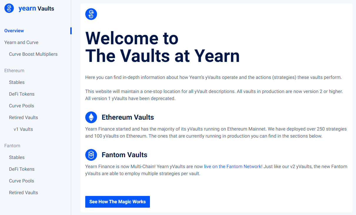
On the left side, you can choose either Ethereum or Fantom vaults and they are aggregated as:
Stables: yVaults made for stablecoins
DeFi Tokens: yVaults made for tokens from the DeFi ecosystem of the chosen network (ETH or FTM)
Curve Pools: yVaults made for tokens from the curve.fi ecosystem
Retired Vaults: old yVaults that aren’t used anymore
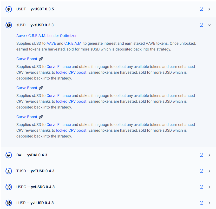
When you choose a section you’ll see a list of vaults. You can click on a vault to expand it and see the descriptions of all the strategies that it uses:
If you want to dive deeper into numbers for each vault/strat you’ll need to hop into our next tool! Which is Yearn Vision:
Yearn Vision
Link: https://yearn.vision/
Yearn Vision is a complete analytics dashboard suite with many pre-made views to analyze historical data from vaults and strategies. Let’s breakdown some of what can be found here, starting with the home page:
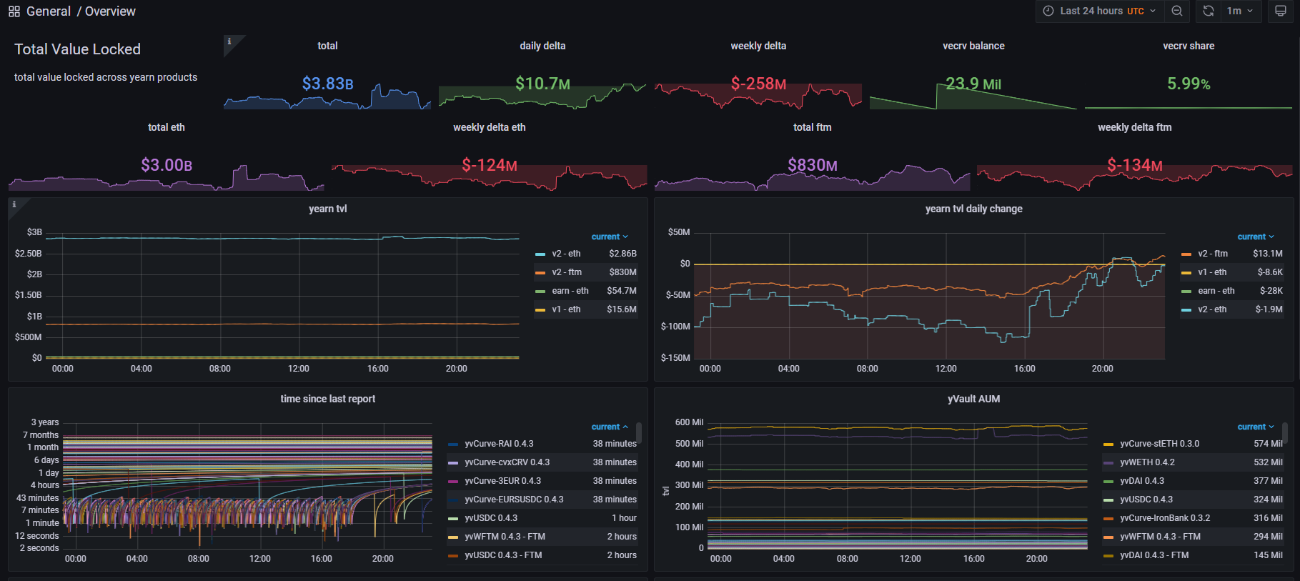

This page gives us a lot of information on the overall health of all Yearn Vaults.
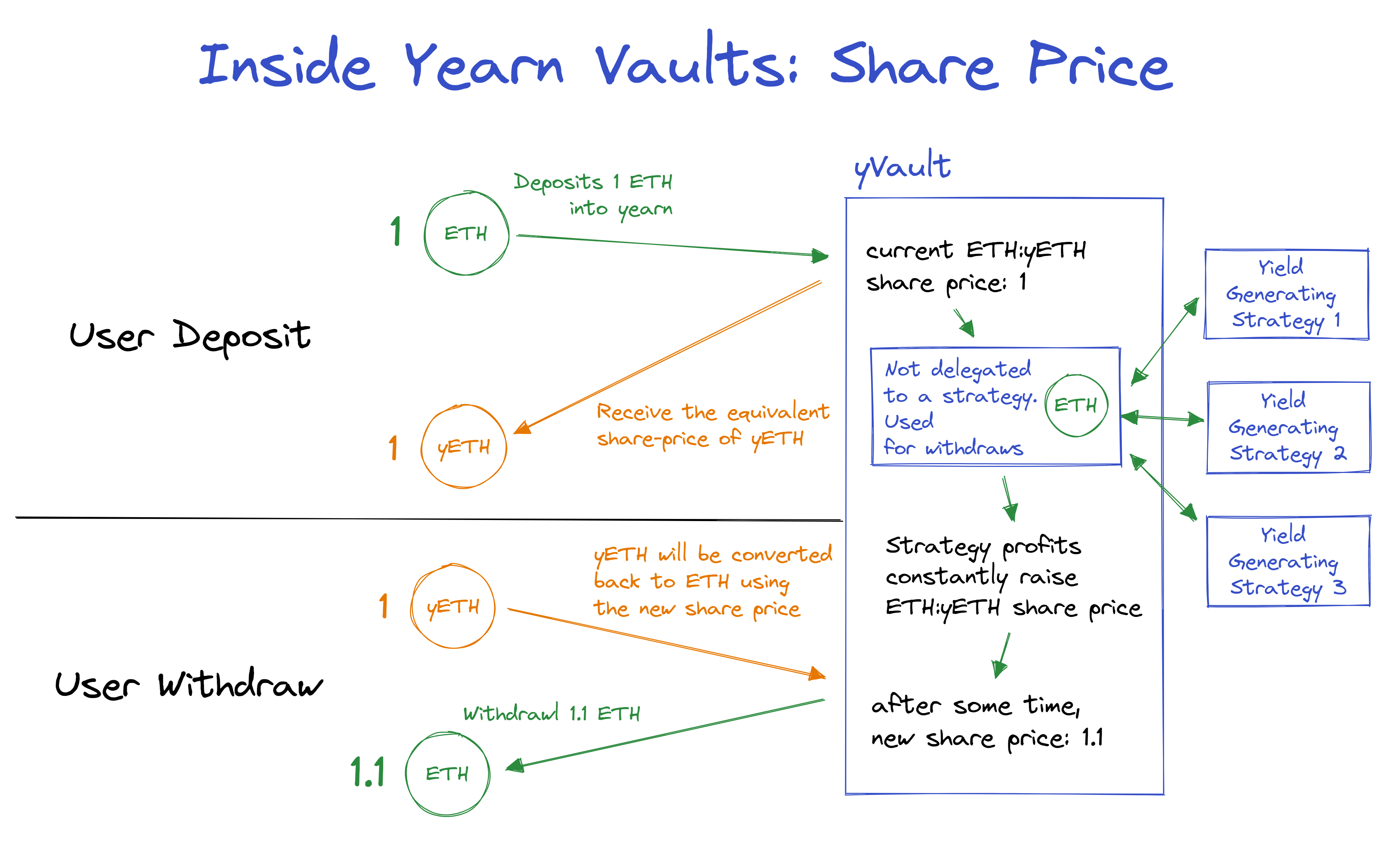
There is information about TVL (Total Value Locked) which represents all funds deposited across all yVaults. We can see both Ethereum and Fantom total TVL and also each network slice. There are some charts showing daily/weekly deltas, which are comparisons with present data and past ones. “share price” is also an important metric to follow, it represents the vault’s lifetime gains in the form of a number which grows over time above 1.0. Below you can see a share price example for ETH to yETH. Here is how “share price” works:
Back to the Vision dashboard, on the top-right corner, you can always change the time range which will update most charts.
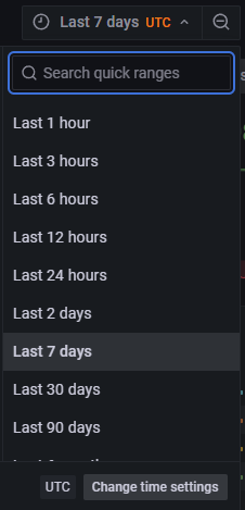
Don’t get scared by the charts with many colors they normally show all vaults/strategies and you reduce the noise by selecting only the one you want to learn more about. You can click on the list of items to filter analytics by a single part, most of them will come with all items selected by default so you’ll have to pick the vault you want to check:


“time since last report” means when this vault strategies were last harvested. The above “Filtered” chart is an example of all harvest from the USDC yVault that happened the last week, the vertical drop means that a harvest happened so “time since the last harvest/report” goes to 0
You can switch to other dashboards on the left side of the screen:
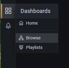
Here you’ll find plenty of dashboard to dive deeper into what’s happening at Yearn!
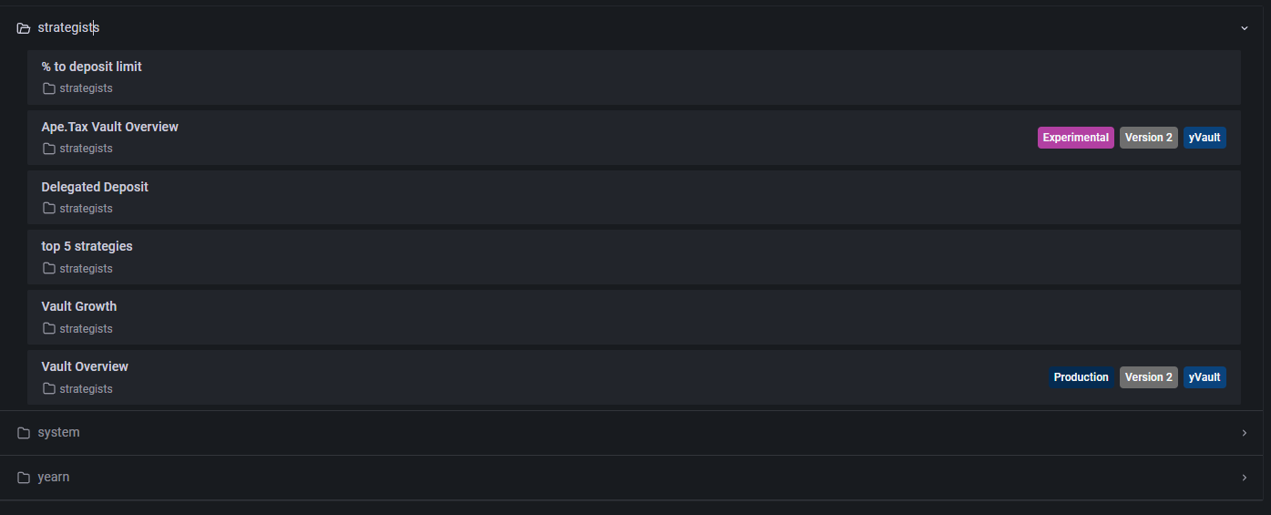
Let’s take a peek at the “Vault Overview” dashboard:
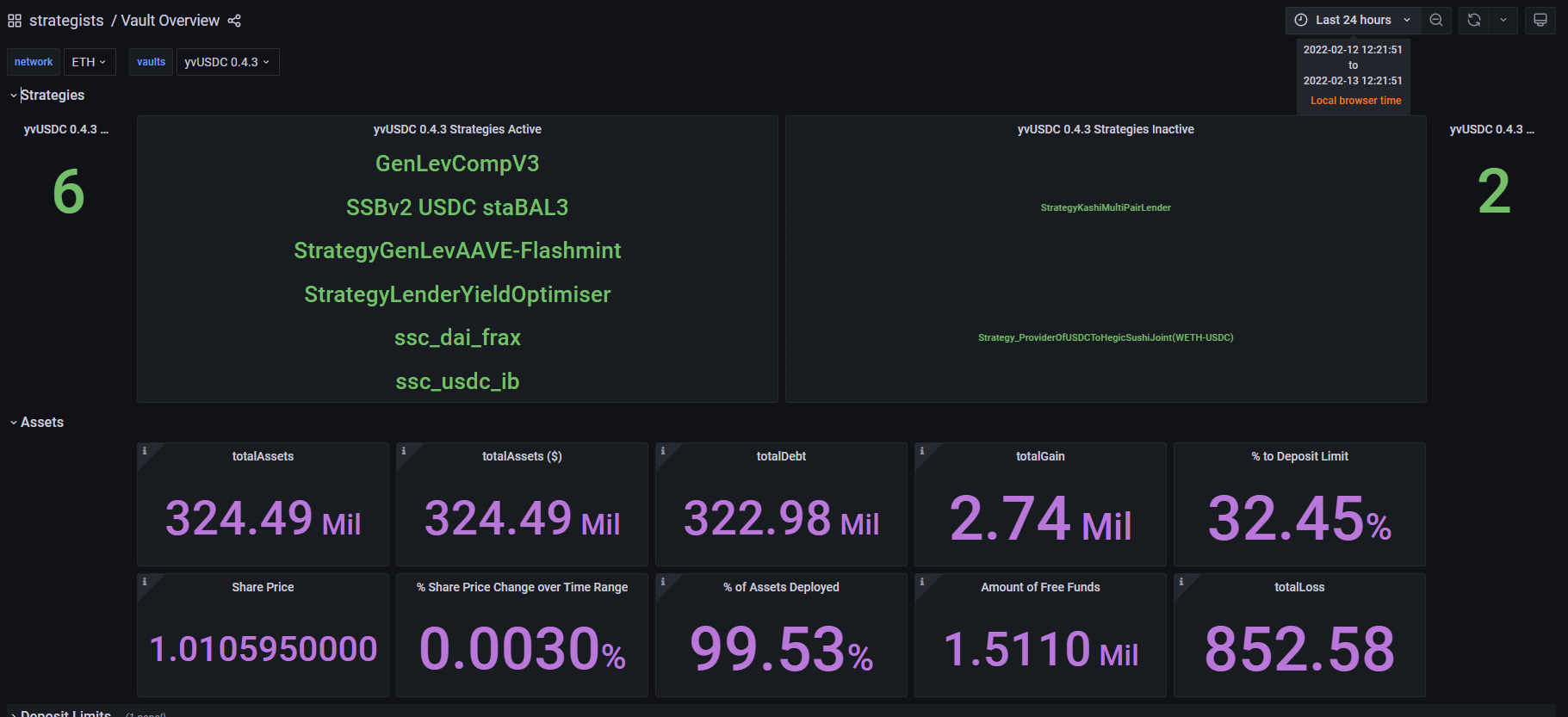
In this Vault Overview dashboard we can see there are 6 active strategies for the USDC yVault: “totalDebt” is the amount that the vault is delegating to these strategies, “amount of free funds” means how many funds are available for cheap (gas-wise) withdrawal, when this number is less than the amount you’d like to withdraw then the transaction will cost a bit more gas because the vault will have to take funds delegated to strategies and make more operations in the process.
We’ll use yearn.watch later to look at how the funds are delegated proportionally for each strategy.
There are also great dashboards for inspecting Yearn’s overall health, and you can even monitor the DAO’s treasury:

Yearn Watch
Link: https://yearn.watch/
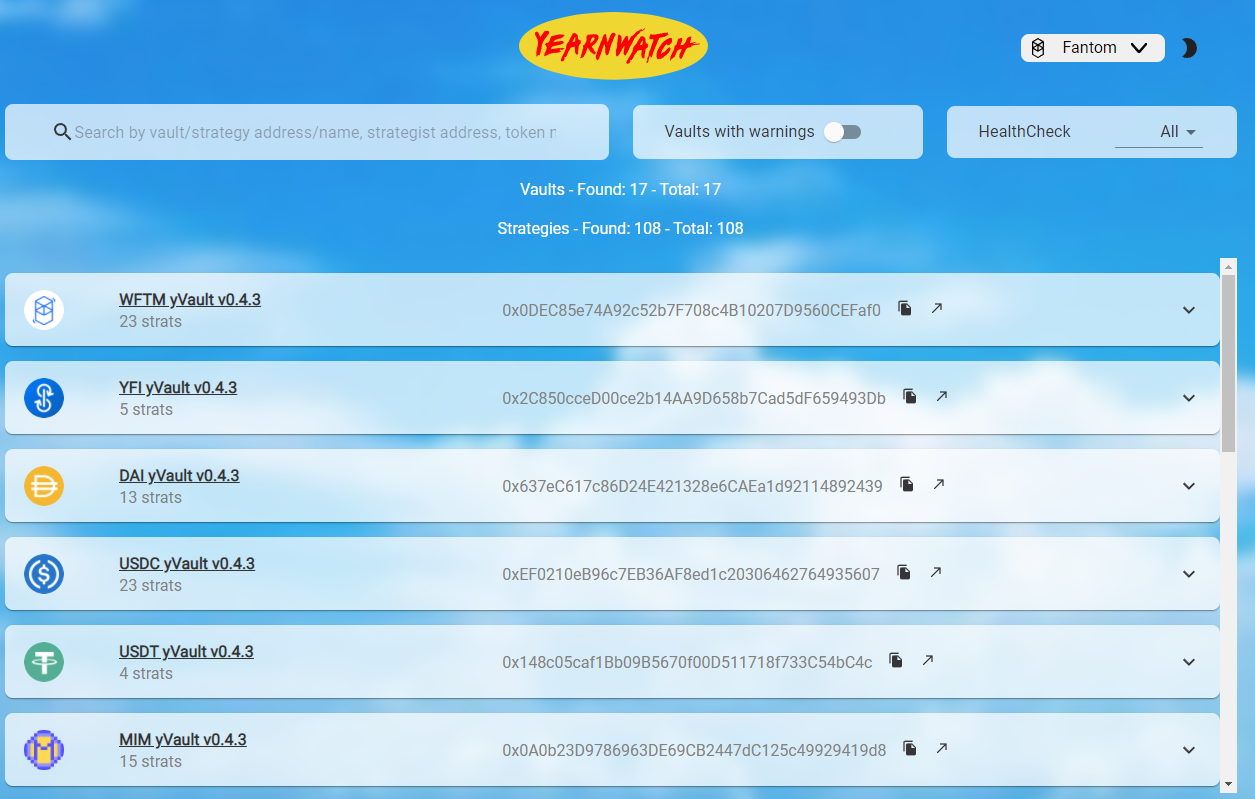
Yearn Watch is a dashboard made by strategists for strategists, so you can quickly navigate through important information about each strategy’s health. The home screen already greets you with all vaults:
If you open a vault you’ll see information on assets allocation. I used a part of this view in the Yearn Vision section, let’s see the complete view for that USDC yVault:
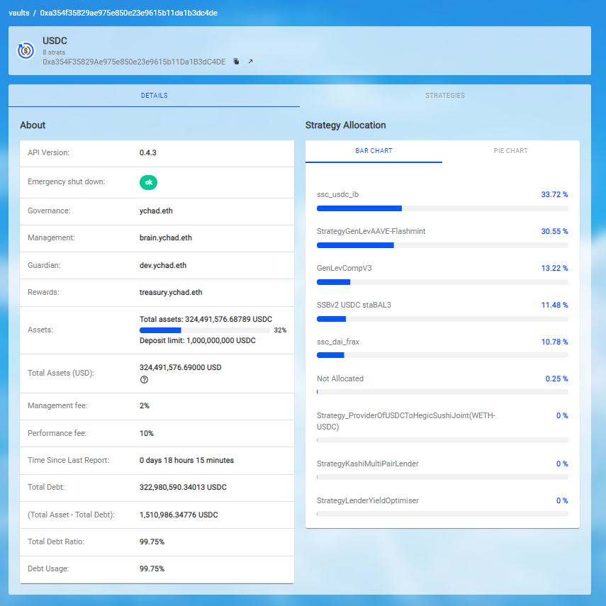
The “details” view shows everything about the overall fund’s allocation. If you change to the “strategies” view you can dive even deeper and inspect each strategy individually and easily find their contracts and on-chain transactions.
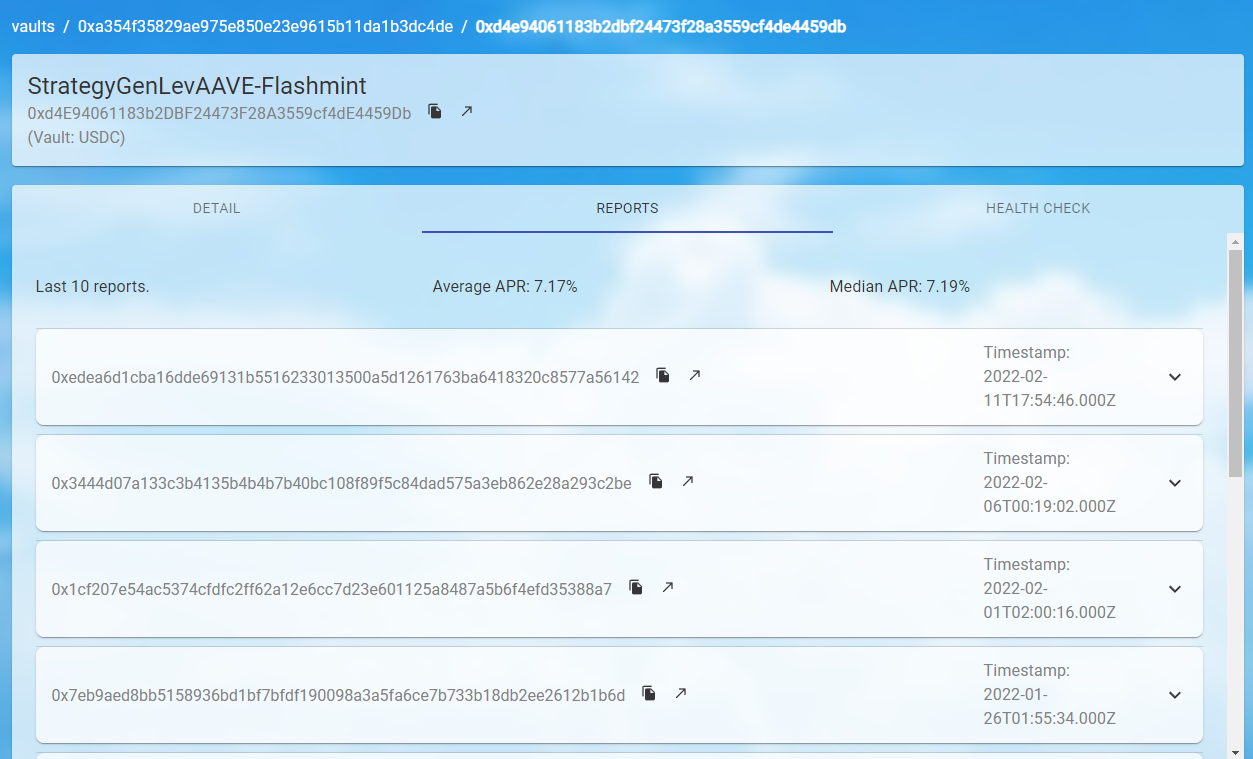
Once inside a strategy, an insightful view is the “reports” (harvests) which show you the last 10 harvest transactions so you can monitor the real-time gains of the vault and monitor the profit from each harvest:
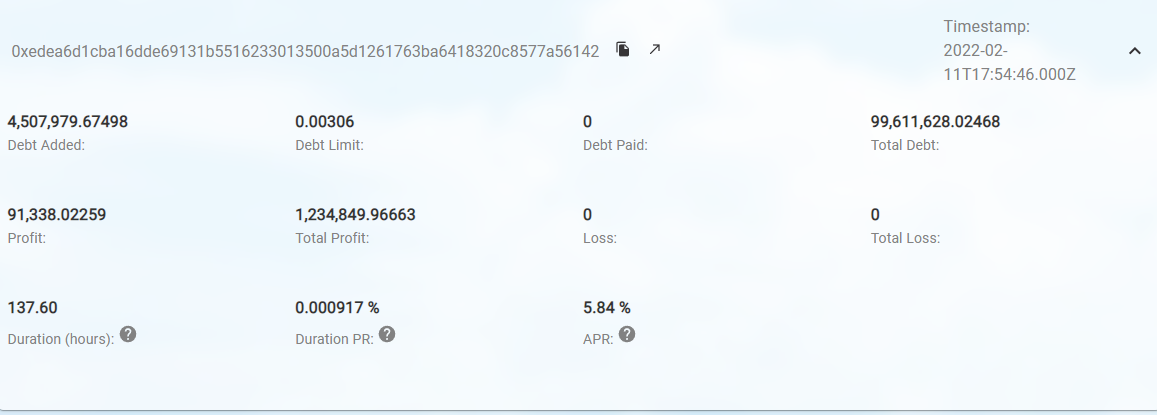
Expanding an individual report for more information:
That’s Yearn Folks!
I hope this article helps people extract good information about their deposits at Yearn! It’s great to be able to access the same tools that the veterans working on these products use to monitor them, there is a lot of valuable information about the past and present of Yearn’s yVaults and products.
Producer: *Worms, Reviewer: *Dark Ghosty
Thanks a lot Dark Ghosty for going through all these dashboards and showing me how to navigate them ❤
Made in yearn.finance